Whenever I think of real-time data, I remember Mark Edmondson’s talk at Measurecamp Copenhagen in 2022, saying, “Real-time dashboards are useless unless you have a real-time person looking at them, making real-time decisions.” That one thing stuck with me because I’ve always said that the best attribute data can have is not necessarily precision or consistency but actionability.
Think about the last time you drove to the supermarket or microwaved popcorn. You looked at your car’s dashboard or microwave’s display and immediately knew what to do. You knew whether to speed up or slow down if you were out of gas or if you burned your popcorn.
Can we say the same about the marketing dashboards we use? Are they leading us to action?
This article will explore Piwik PRO‘s new real-time dashboarding feature (currently in alpha). I will show you how it works, what you can do with it, and how you can create personalized dashboards that make sense for your business context in a matter of minutes, all within the same interface, without worrying about data sampling issues or tool connectors.
Understanding Real-Time Data
Real-time data is data that is available immediately after collection, which should enable immediate insights and quick decision-making.
You can monitor and understand customer behavior, track campaign performance, and product launches, and adjust strategies on the fly. It’s also valuable for QA-ing tracking implementation, testing features, testing bug fixes, verifying a/b test variants, etc.
While real-time data is valuable, it comes with challenges.
If you have large amounts of data streaming in, it can be overwhelming to identify what’s important. Always look for tools that allow you to use a lookback window to isolate different time instances you want to review.
If your tracking implementation is faulty and you’re planning to use a real-time dashboard to track your campaigns’ performance, for example, you might react to the wrong data, which can cause you to make the wrong decisions.
Kristian H. Lauritsen, CPO at Piwik PRO, shares:
With real-time dashboards, our objective has been to provide a way for users to close the gap from data collection to insight to action, whether it’s a rapid response to content performance, campaign adjustments, or immediate feedback on site updates. The real-time dashboards aren’t just about showing data faster; they’re about turning data into action quicker than ever before.
And, yes, when it comes to decision-making, real-time data requires quick decision-making, which can only be possible with the right resources and processes.
Planning Your Dashboard
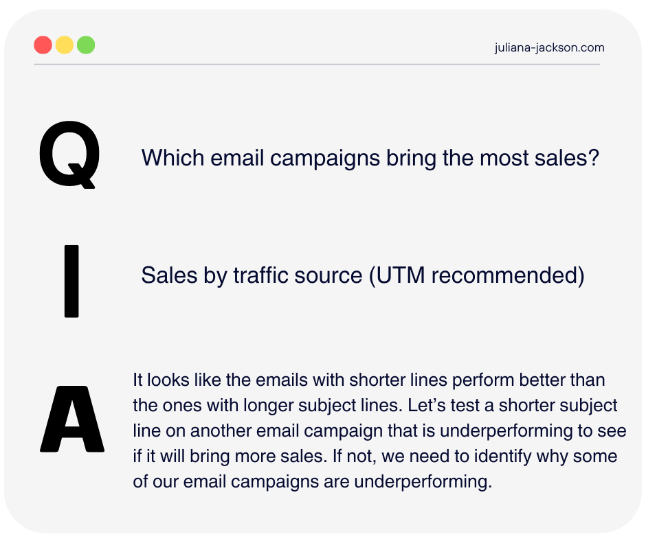
To be truly useful, your dashboard must be more than just a random display of charts and graphics. It should be carefully planned and adapted to your business context. I remember discussing this topic at a few conferences, where I presented the QIA Model that I learned from Chris Mercer from Measurement Marketing.
The QIA model is a framework to narrow down all possible metrics to only those your business needs to grow. You can define QIA by asking three questions:
- What question do I want to answer?
- What information do I need to answer the question?
- What action will I take once I get my answer?
It could look like this:
Learn more about the QIA model here. You should also download the Measurement Marketing Toolbox, which is free and contains 40+ frameworks, templates, and calculators for digital marketers and a data strategy course.
It all starts by asking yourself: What problem am I trying to solve? What business questions do I need answers to? By defining these goals upfront, you ensure your dashboard provides actionable insights, not just data.
When building a dashboard, consider the key metrics that drive decisions. Focus on what truly matters to your business objectives. This way, every data displayed has a purpose and guides you toward specific actions. A well-planned dashboard shouldn’t be cluttered with irrelevant information; it should be a streamlined, efficient tool that helps you make informed decisions in real time.
Introduction to Piwik PRO’s real-time Dashboard
Last month, I met with Kristian H. Lauritsen (CPO) and Kuba Bomba (CTO) to discuss what’s on the horizon for Piwik PRO in 2024.
Our fireside session covered many interesting topics, from developing AI-supported features to solve problems like predictive analytics and anomaly detection to rolling out real-time dashboards tailored for dynamic decision-making and advancements in their Customer Data Platform (CDP) for better audience targeting and integration capabilities.
However, as a blogger, I got really excited about the real-time dashboarding feature, so I had to try it out once I got early access to it.
First of all, this is not real-time reporting. This feature allows you to create interactive dashboards from scratch, where you can add different filters different types of visualization, and compare segments side by side. It’s completely DIY, so you won’t be hit by interface limitations that you might be used to in other analytics tools that only provide real-time reports.
Of course, there are still some interface limitations in terms of the number of types of data visualizations you can use in the dashboard, how comparisons look, available metrics and dimensions, and so on. However, when I am testing this, the feature is still in alpha, and the team is improving it.
How do you create a real-time dashboard in Piwik PRO?
Creating a real-time dashboard in Piwik PRO is similar to creating a regular one. This video covers the process step by step, and I will not repeat each step for the purpose of this article.
However, if you are entirely new to Piwik PRO, you can watch the video first and return to the article. They also provide free product training in the Piwik PRO Academy, delivered by Anil Batra from Optizent.
Let’s do this!
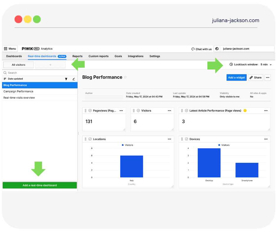
To get started with Real-Time dashboards, log into your Piwik PRO account, go to Menu > Analytics, and then navigate to the Real-time dashboards tab.
On the left, click Add a real-time dashboard, give it a nice name, select the visibility you want to give it, and click Save.
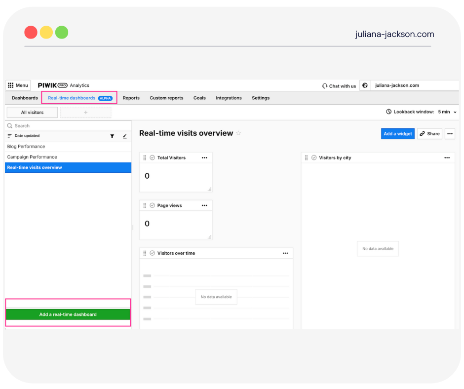
Once you complete these steps, you should have a nice blank canvas to assemble your planned dashboard.
In my examples for this article, I will show you how I’ve built two real-time dashboards: one for the performance of my latest blog article and one for the performance of campaigns. These dashboards are starters meant to help you understand how the feature works, not comprehensive dashboards, because, let’s face it, I am using my personal blog as a demo site.
Important before you get started:
If you are using Piwik PRO without a consent banner, you will likely have these 2 settings turned off:
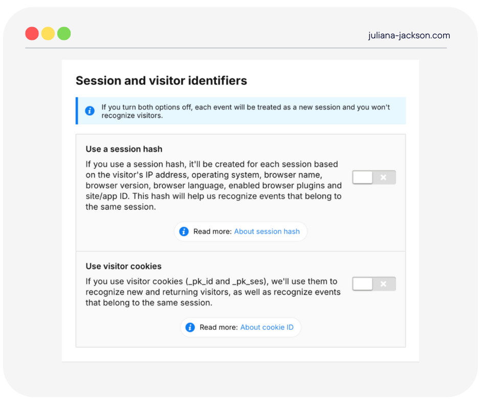
With these two options off, the data won’t be accurate because each event will create a new session. This can make it hard to build a meaningful funnel or user flow.
If you turn these two settings on, you must also turn on your consent banner on the website and start collecting consent from your visitors.
Piwik PRO is one of the very few analytics platforms that can be legally used without a consent banner, so if you prefer to keep it that way but also want accuracy with your real-time data, there is an option for that, too that requires a bit of extra setup. Check it out here.
I previously used Piwik PRO without a consent banner. Still, I decided to turn on consent collection and enable the session identifiers, so now my data in the real-time dashboards is accurate.
Building the dashboard
Example 1: Blog performance
As a blogger, I love seeing my article’s initial engagement once I promote it on social media. However, my last published article was a while back, so I thought I couldn’t simulate the same use case—but then, I remembered there was a solution to my problem.
I asked my colleague Elena Nesi, who built the “Web Data Playground” solution that won the Superweek Golden Punchard Prize, to help me.
Elena built this tool to simulate real-world web traffic, but it’s not your average traffic simulator. It’s crafted to deliver a variety of diverse browsers, devices, acquisition sources, user behaviors, and conversion rates, essential for authentic data analysis and meaningful demo datasets.
She initially built this to train her team and experiment with GA4 and BigQuery, but I asked her whether we could adapt it to work with Piwik PRO and my website.
As always, she summoned her fairy codemother skills and helped me out. So now, if you are playing around with a Core Plan of Piwik PRO and your website doesn’t have enough traffic to test Piwik PRO properly, you can use Elena’s solution.
Once Elena plugged her solution in, I started working on the dashboards.
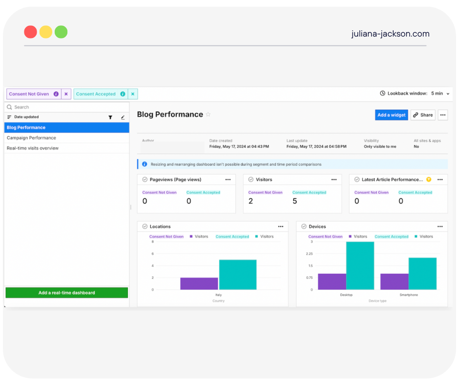
I went for a simple approach by adding 3 counter widgets. One for pageviews, one for visitors, and one for my latest article performance. The counter shows me in real time how many hits my article gets. This is how you can set up a counter that tracks a specific page URL:
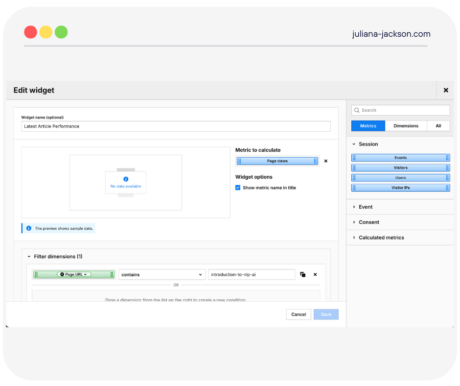
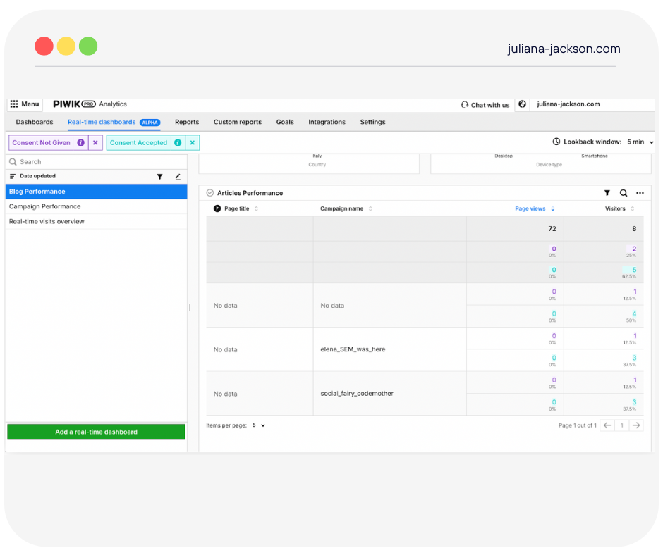
Then, I added two bar charts to show locations and devices and one table to examine the performances of other articles based on the campaign name.
And it looked like this:
Good to know:
As you can see in the screenshot, the real-time dashboard has some other cool features that are also available in regular dashboards. First, you can add different segments and compare how the various segments you define behave. Then, just as in regular dashboards, you can enable dashboard details. This can show who created the dashboard, its visibility, and when it was last updated.
Then we have my favorite new one: The Lookback window, which allows you to go back 5-60 minutes in time. This feature is based on Piwik PRO’s server time, recorded when the event hits the server.
Note: There may be some differences between real-time dashboards and other reports because reports contain data that is calculated and cleaned up after the session ends.
Remember, my dashboard is a starter. You can decorate yours and adapt it to your own needs.
Example 2: Campaign performance
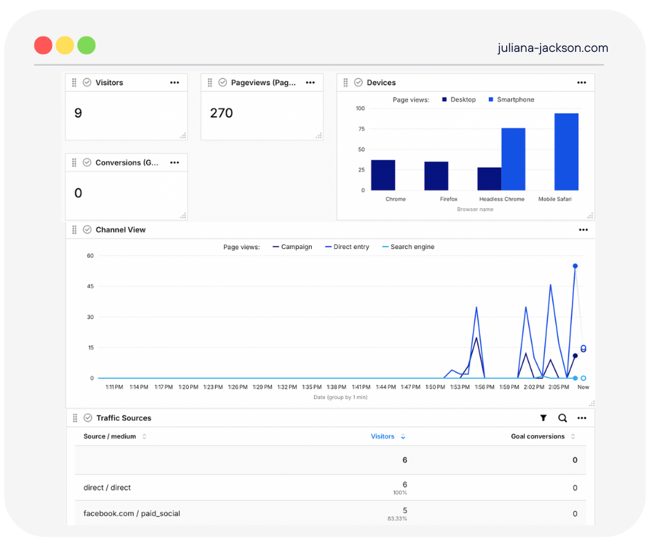
For campaign performance, I created a simple dashboard using counter and bar chart widgets. I also added a line chart widget showing the channels people visit the website from and a table chart showing what sources drive conversions. And it looked like this:
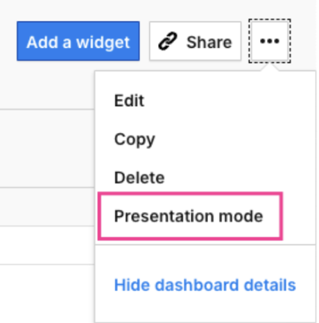
While working on this dashboard, I noticed a very nice surprise: a new “Presentation Mode” feature that can compress and structure all your charts into a nice new fullscreen view:

You can find the feature here:
This is particularly useful when you want to continuously display your dashboard on another screen or TV. Imagine it’s BFCM (Black Friday—Cyber Monday), and you and your team can watch your sales numbers on a big screen in your office.
The presentation mode also solves the problem of being logged out after 30 minutes of inactivity, which happens when you open your Piwik PRO account in a tab but don’t use it. It displays real-time data for up to 12 hours or until you close the tab.
For security reasons, you automatically get logged out when you start presentation mode, but the mode displays real-time data without interruptions.

Adding Segments for Comparison
Another thing I noticed in the real-time dashboard feature is that it also allows you to do different segment comparisons, just like in the regular dashboards. This means you can use your existing segments or create new ones and see your real-time data in other ways that make sense to you or help you understand visitor behavior better.
Because I had to turn on the Consent Form to use this feature properly and without issues with data accuracy, I created two segments: one for visitors who gave consent and one for visitors who didn’t. This way, I could see the consent scope value in real-time in my newly created dashboards.
Remember that once you add these segments to your dashboard, the view might get compressed, or the tables/charts you use might be displayed funny. You won’t be able to resize and rearrange the dashboard during the segment and time comparisons.
So, my advice is to create and design your dashboards to allow a good side-by-side comparison, meaning not to cram a lot of widgets in the same space (like I did 🙂)
To create a new segment, click the + sign next to the All Visitors tab and then click Manage Segments > Add a new Segment.
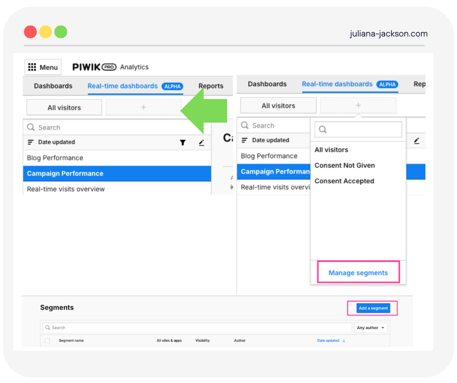
As in the case of dashboards, you need to give it a name and select the proper visibility for it and the instances you want it to apply to (all sites and apps). Once you do that, use the appropriate dimensions/metrics and set the conditions you wish for the segment you are building. Check this helpful article here for a step-by-step guide.
Once the segment is created, you will click the + sign next to All Visitors, and you will be able to select it from the drop-down list and apply it to your dashboard. This is what it looks like:
Things to keep in mind about the Real-Time Dashboarding feature in Piwik PRO
For now, the feature is in Alpha mode. It’s an early feature version, so changes, updates, and continuous improvements might occur. By the time this is available more broadly, it can look different than my article. This article is the first view on it.
Remember that real-time dashboards show data from the past 5 to 60 minutes. Typically, data is refreshed automatically every 10 to 30 seconds, but large data loads may cause some slowdowns. The lookback window is based on Piwik PRO’s server time, recorded when the event hits the server.
There may be some differences between real-time dashboards and other reports because reports contain data that is calculated and cleaned up after the session ends. Take goals, for example. By default, there can only be one conversion on a given goal, but it can be triggered many times. In the Real-Time Dashboards, you can see many conversions coming from one visitor, and later, in processed data, there is only one conversion because obsolete ones were cleaned up during processing.
For now, some dimensions are not available in real-time dashboards. If at least one dimension is used in a segment, custom channel grouping, or calculated metric, it can’t be applied to the real-time dashboard.
Real-time data is available using API, not just in the user interface. There are two endpoints available:
- Raw data API – get events in near real-time
- Query API – get reports in near real-time
Conclusions
Real-time data can be a game-changer if used right. Piwik PRO’s new real-time dashboarding feature, even in its alpha version, is already showing promise. I love creating interactive dashboards without worrying about data sampling issues. It’s simple enough for novices and powerful enough for experienced users, providing quick answers without a steep learning curve.
This article covered just two examples, but you can create dashboards for many use cases. Think of QA dashboards for tracking new events or a dashboard to monitor the success of your new product launch.
Remember, a useful dashboard isn’t just a collection of charts. It needs to be well-planned and aligned with your business goals. Use frameworks like the QIA model to ensure your dashboards provide actionable insights.
While I don’t have the exact release date for this feature in Piwik PRO, the team is working on an announcement soon.
You can start using Piwik PRO for free with their Core Plan. And if your test website doesn’t have enough traffic, you can use Elena’s solution to simulate real-world web traffic.
Happy dashboarding!