Most businesses still analyze language the way they analyze transactions: through spreadsheets with sentiment scores, dashboards showing topic frequencies, and charts tracking keyword trends over time. These formats support basic reporting, but they fundamentally misrepresent how language operates in the real world.
Especially when we’re dealing with app reviews, customer support chats or social data like comments, reviews, memes, cultural references, and entire discourse communities.
What we’re actually looking at is a decentralized, unstructured, constantly evolving system. All of these moments are signals in a dynamic network of meaning.
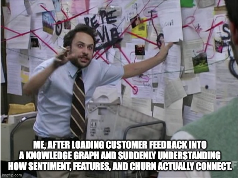
Aaaaaand, I used to do the same. I relied on spreadsheets and dashboards to surface narratives from language data, until I started learning about knowledge graphs from Krasimir Bambalov. That shift reframed how I think about language, structure, and meaning. This newsletter edition is my way of sharing what I’ve learned so far, in case it helps others in the community rethink how they’re working with text, language models, and high-context input.
Table of Contents
Keep in mind this shift is epistemological. Today, language has become the infrastructure.
And with the rise of large language models, the way we represent and process language now shapes everything from search engines to customer service to internal knowledge systems. And by still flattening this high-signal input into rows and sentiment scores, we’re missing the deeper structures of connection, influence, and context that language data actually holds.
What’s at stake is not data accuracy, but unlocking strategic signals embedded in the way people talk, think, and respond. Knowledge graphs offer one way to preserve that structure. They don’t just store what was said. They show how meaning travels.
With that energy, let’s dive in.
The Structural Blind Spots in Language Analysis
Think about how traditional data structures handle information:
- Spreadsheets and tables: Information sits in rows and columns with rigid categories
- Dashboards: Data gets aggregated into averages and totals
- Reports: Data is isolated into separate sections with minimal connections
When we flatten language into these structures, we commit a kind of structural violence (lol) against meaning itself. Real conversations, customer feedback, and market intelligence don’t exist as isolated data points, they form an interconnected web where context matters as much as content. (see my article about this)
This structural problem creates tangible business limitations:
- Lost context: A negative comment about pricing might actually be feedback about perceived value, but that nuance disappears in flat sentiment analysis
- Invisible relationships: Connections between product features, customer segments, and communication channels become invisible
- Inability to trace influences: The way topics influence each other, perhaps how shipping concerns impact brand perception, simply can’t be represented
Put simply: traditional data structures force 3D reality into a 2D format. It’s like trying to understand a conversation by reading individual words without seeing how they form sentences and narratives.
The Math Behind Graph Thinking
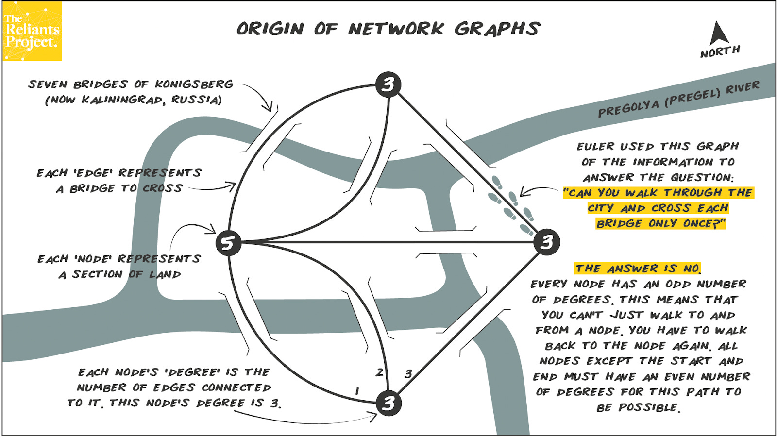
Interestingly, the solution to this modern business problem has roots in 18th-century maths. Graph databases originate from graph theory, a concept created in 1730’s Prussia.
The Seven Bridges of Königsberg problem asked whether it was possible to walk through the city, crossing each of its seven bridges exactly once without retracing steps. Mathematician Leonhard Euler proved it was impossible by abstracting the problem into a network of nodes (landmasses) and edges (bridges) and so, creating the foundation for graph theory.
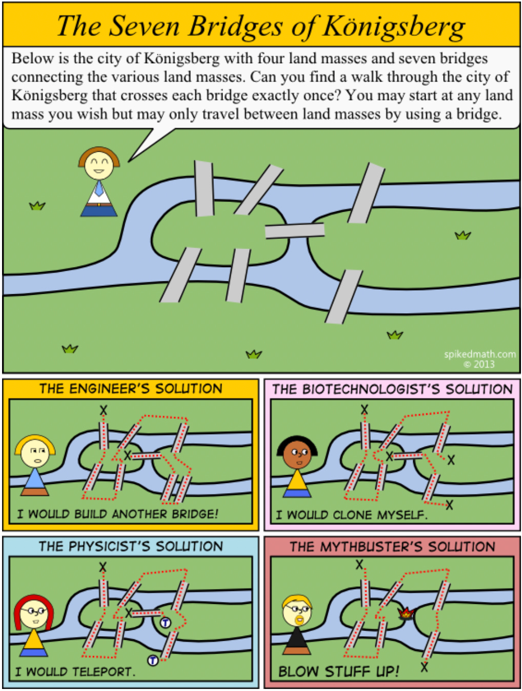
Ssome problems are best understood as networks of relationships rather than collections of individual elements, is precisely what makes knowledge graphs so powerful for modern language analysis.
Learn more » GraphAcademy by Neo4j
How Graphs Restore Meaning to Language Data
Knowledge graphs offer a fundamentally different approach to representing information. Rather than forcing data into tables or charts, they mirror how information actually exists in the real world as a network of connected entities with meaningful relationships between them.
What Makes Graphs Different
The core difference lies in structure:
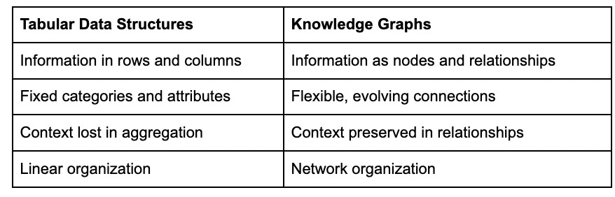
In a graph, everything becomes both content and context simultaneously.
A customer isn’t just an entry in a table, they’re connected to products they’ve purchased, topics they’ve mentioned, sentiments they’ve expressed, and channels they’ve used.
Example:
How Knowledge Graphs Preserve Meaning
Yesterday morning, I spent a few hours prototyping this, and instead of focusing on text categorization, I focused on preservering the internal logic of communication:
- Entities become nodes (people, products, topics, channels)
- Relationships between entities become connections (mentions, expresses, relates to)
- Properties provide context (sentiment strength, date, importance)
Using language models to identify topics and sentiment, I mapped these elements into a graph where platforms, topics, and tone became structurally linked nodes and relationships, preserving not just what was said, but how and in what context.
These were my steps:
- I generated a fictional dataset (100 rows) of customer feedback using GPT, covering two brands, multiple platforms, and timestamps.
- Stored it as a CSV in GitHub, then used the raw file URL to load it into Neo4j Aura.
- Connected Google Colab to Neo4j using Python and the neo4j driver.
- Used DistilBERT to classify the sentiment of each message (positive/negative).
- Used KeyBERT to extract key topics from each entry (e.g. “UX”, “pricing”, “support”).
Structured everything into a knowledge graph in Neo4j:
- Brands and platforms became nodes.
- Topics became nodes.
- Sentiment was attached to the relationships:
- (:Brand)-[:PERCEIVED_AS {sentiment}]->(:Topic)
- (:Platform)-[:EXPRESSED {sentiment}]->(:Topic)
Result: A graph you can query, explore, and reason over, showing how sentiment and themes flow across platforms and brands.
Here is an example:
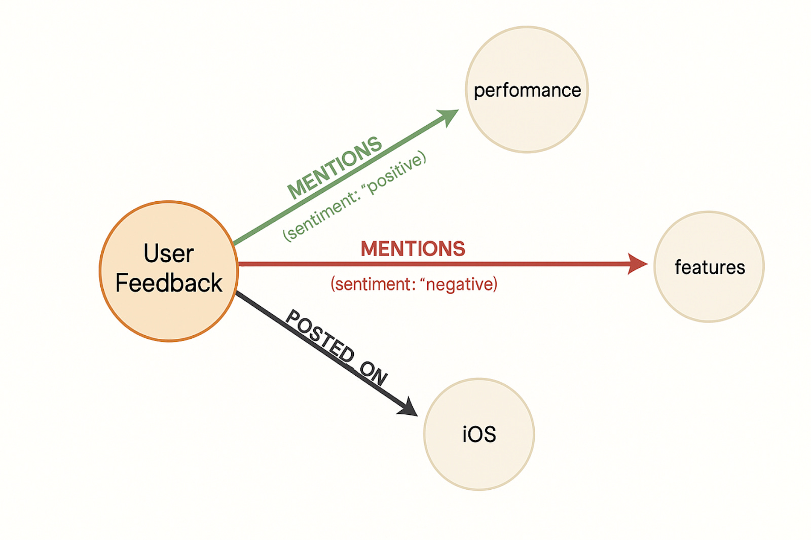
Nodes:
- User Feedback: Represents the core entity (e.g., a review or comment).
- Topic nodes like Performance, Features: These are the subjects being discussed.
- Platform like iOS: Where the feedback originated.
Edges (Relationships):
- MENTIONS connects the User Feedback to specific Topics. Each relationship carries a sentiment property (positive, negative), which is exactly how you’d model contextual metadata in a graph.
- POSTED_ON connects the feedback to a platform — again, this is a clean, declarative way to indicate origin.
The Business Value of Graphs: Questions That Create Competitive Advantage
Graphs provide concrete business value by enabling questions that traditional analytics simply can’t answer questions that often hide the most valuable perspectivs:
Market Intelligence:
- How do discussions about our pricing connect to conversations about competitor features?
- Which product attributes appear most frequently in positive social media mentions but are absent in negative support tickets?
- What emerging narrative threads connect our brand to adjacent markets we haven’t considered?
Customer Understanding:
- How does sentiment around specific features differ between customer segments?
- Which pain points cluster together across different communication channels?
- What hidden relationships exist between reported issues and renewal decisions?
Communication Effectiveness:
- How does messaging resonance change when moving from social media to email?
- Which specific product attributes create emotional responses in different contexts?
- What narrative structures in our messaging create the strongest engagement?
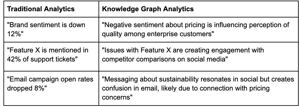
Conventional analytics might tell you that a particular topic has a negative sentiment score of -0.7, but a knowledge graph can show you how that sentiment connects to specific features, how it evolves across different platforms, and which customer segments it affects most strongly.
From Metrics to Insight Networks
This method transforms isolated metrics into (hopefully) actionable insight networks that reflect the actual complexity of your business environment. (I see you Tim Wilson)
The Transformative Power of Combining LLMs with Graphs
Combining LLMs and knowledge graphs creates something greater than the sum of its parts, basically a system that understands language while preserving its structural relationships.
Why I am excited about this:
LLMs and graphs complement each other perfectly:
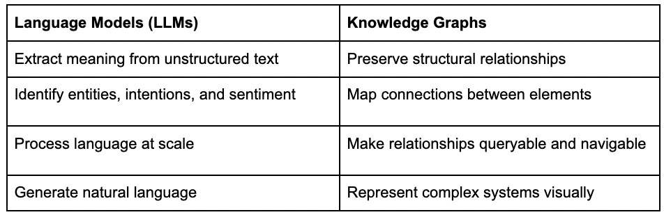
When these approaches work together:
- Unstructured becomes structured: LLMs transform messy text data into structured entities and relationships
- Isolated becomes connected: Graphs connect formerly siloed insights across departments and data sources
- Static becomes dynamic: The resulting system evolves as new information flows in, revealing emerging patterns
- Impenetrable becomes explorable: Complex language dynamics become visually navigable, even for non-technical users
For businesses, this means:
- Reduced blind spots: Seeing connections across previously isolated data silos
- Higher decision velocity: Finding answers to complex questions without manual analysis
- Competitive intelligence: Identifying emerging trends and connections before they become obvious
- Institutional memory: Creating a persistent, queryable record of how ideas and topics relate
PLS DON’T GET THIS WRONG: This does not “cancel” classic analytics, it’s simply a different approach to organizational intelligence that preserves the fabric of meaning that makes business communication valuable in the first place.
Real Business Impact: Use cases
Organizations at scale are already applying this graph-first approach with transformative results. Here are some use cases I found from Neo4j, the graph database technology category leader:
- eBay redesigned its product recommendation engine using Neo4j and achieved query speeds thousands of times faster than their previous MySQL implementation, while reducing code complexity by a factor of 10 to 100.
- Walmart uses graph-native infrastructure to deliver real-time shopper recommendations across billions of transactions, connecting behavior, products, and intent in a way traditional systems couldn’t support.
- In telecom, Telenor rebuilt its access control system using Neo4j and realized a 1,000× performance improvement.
These examples demonstrate how organizations operating at scale use knowledge graphs not just for insight, but for operational leverage.
Adoption reflects this shift. According to the DB-Engines Ranking cited in Neo4j’s whitepaper (linked below), graph databases have grown nearly sixfold in popularity over three years, becoming one of the fastest-growing categories in data infrastructure.
When relationships between data points matter, as they do in most language, customer, and operational systems, graphs deliver performance and clarity that conventional models struggle to match.
Source: Neo4j, “Powering Real-Time Recommendations with Graph Database Technology” Whitepaper.
Where does this take us?
Imagine your company has launched a new product. Using conventional analytics, you receive three separate reports:
- Social Media Dashboard: Shows 62% positive sentiment, with keywords “innovative,” “expensive,” and “waiting”
- Customer Support Analysis: Reveals 28% of tickets mention installation issues
- Sales Pipeline Report: Notes 45% conversion from trials, below the 60% target
These reports sit in different departments and systems. Any connections between them require manual analysis and intuitive leaps by analysts who might never see all three reports.
Now imagine the same data in a knowledge graph:
What You Can Suddenly See:
- The installation issues mentioned in support tickets are disproportionately connected to enterprise customers, explaining the lower trial conversion
- Social media mentions of “waiting” are directly connected to a specific user onboarding step, not product availability as assumed
- Users who mention “expensive” but still convert show distinctive usage patterns focusing on three specific features not currently highlighted in marketing
The Business Decisions That (should) Follow:
- Prioritize fixing the enterprise installation workflow (not the consumer onboarding that was initially blamed)
- Redesign the specific onboarding step causing confusion and “waiting” mentions
- Adjust marketing to emphasize the three features that justify the price point for converting customers
The Future of Language Understanding
What excites me most about this space is how graphs let us treat language as the interconnected system it truly is. Rather than flattening meaning into categories, we can preserve its structure and make it explorable.
This approach opens up possibilities for:
- Tracking how narratives evolve across platforms and over time
- Identifying influential connection points where topics and sentiments intersect
- Creating more nuanced understanding of communication that respects its inherent complexity
In a world drowning in information but starving for meaning, tools that preserve the relationships between ideas will be essential.
Getting Started with Knowledge Graphs
The good news is that exploring this approach doesn’t require advanced technical skills. Tools like Neo4j Aura provide cloud-based graph databases with visual interfaces, and services like Google Colab make it possible to experiment with language models without complex setup.
Even if you start small, perhaps mapping the relationships between topics in a collection of articles or customer feedback, the shift from flat to connected data can transform how you understand language and the signals you can extract from it.
The future of language analysis isn’t just about more data or better algorithms, it’s about preserving the connections that make communication meaningful in the first place.
If you like my content, consider subscribing to my newsletter: Beyond The Mean.